/01
Tripzi is a simple and reliable taxi booking app designed to make commuting easier. From quick onboarding to selecting your pickup and destination, Tripzi ensures a seamless travel experience. With just a few taps, you can book a ride, track your driver in real-time, and complete your journey stress-free.
Commuters face challenges booking taxis due to complex apps, hidden charges, and lack of transparency. Many services overwhelm users with extra steps, making the process slow. Inconsistent driver availability, poor communication, and unclear navigation add to the frustration of finding a reliable ride.
Tripzi aims to simplify how people book and experience rides. The app is designed to be fast, minimal, and user-friendly for everyone. Our goal is fewer booking steps, transparent pricing, real-time tracking, and seamless payments, while ensuring trust, efficiency, and comfort for every journey.
Tripzi solves these problems with a clean, intuitive interface for quick booking. Real-time driver tracking, upfront pricing, and instant confirmations eliminate confusion and waiting. With verified drivers and an easy rating system, Tripzi ensures every trip is simple, safe, and stress-free for users.
/02
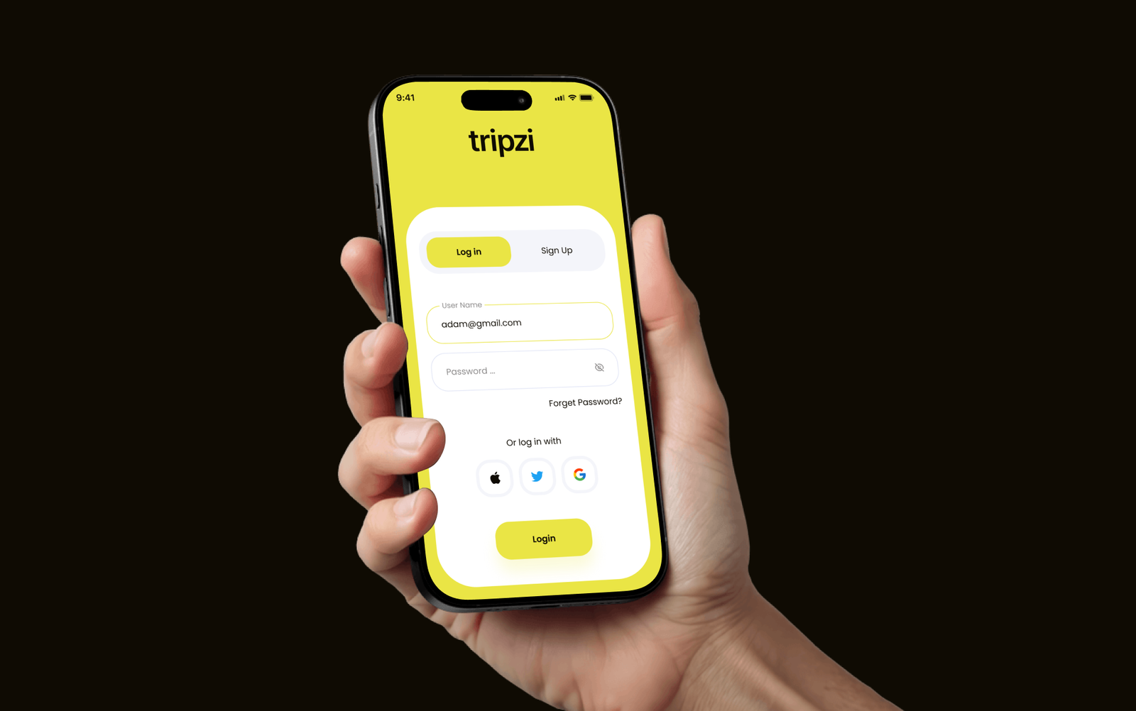
The Tripzi logo reflects simplicity and motion. The clean typography and minimal design symbolize trust, speed, and a smooth ride experience. Its modern look makes it instantly recognizable, representing a service that’s always ready to move you forward.

/03
We used Poppins for its clean, geometric, and modern style. It brings clarity and friendliness to the interface, making every element of the app look approachable and easy to read. The bold weights highlight key actions, while the lighter weights ensure a balanced and professional appearance.

Font Size: 32px | Line Height: 124%
Font Size: 20px | Line Height: 124%
Font Size: 16px | Line Height: 124%
Font Size: 14px | Line Height: 124%
/04
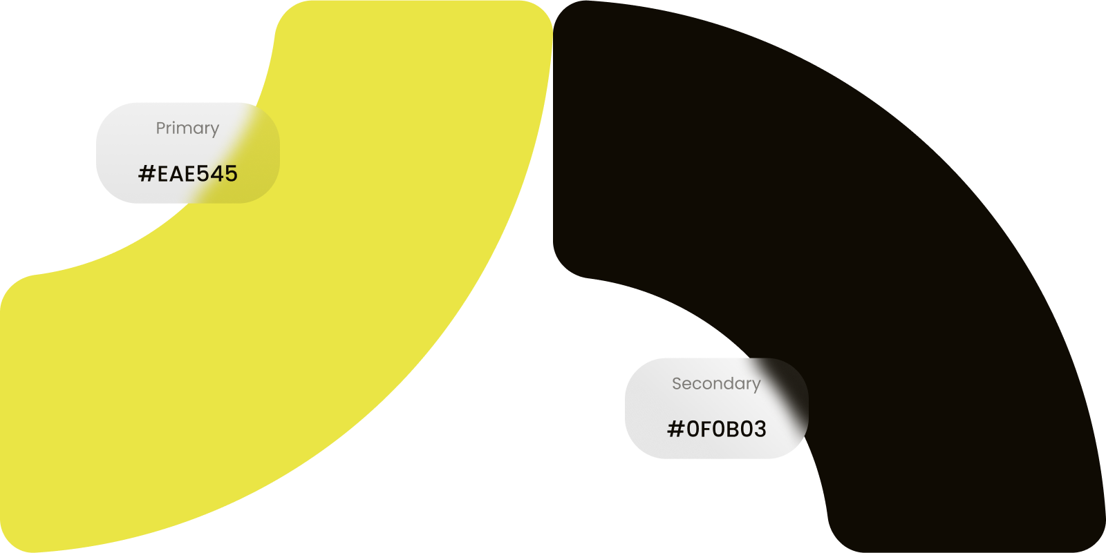
The Tripzi color palette is a blend of bright yellow and deep black. Yellow, Represents energy, optimism, and movement, making the app lively and inviting. Black: Adds contrast, sophistication, and trustworthiness, balancing the energetic yellow. Together, these colors make the app both eye-catching and professional.
/05
Our design process was built around simplicity, usability, and clarity. We focused on making each step — from booking to ride completion — as effortless as possible.
/06
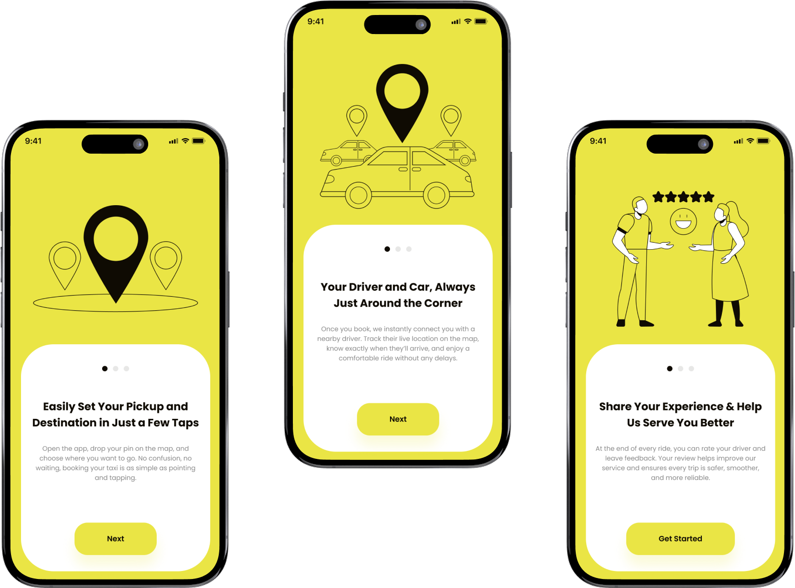
The onboarding screens quickly introduce users to the app’s core features, Locate Your Ride – Choose pickup and destination in a few taps. Find Driver & Car – Track driver arrival in real-time. Rate & Review – Share feedback to improve service quality.
This makes first-time users comfortable and confident from the start.
/07
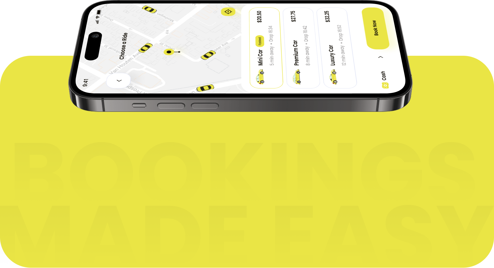
Users can explore available taxis nearby and select the one that best suits their needs — from economy rides for quick commutes to premium cars for extra comfort. Transparent pricing and clear car details ensure the right choice every time.
/08
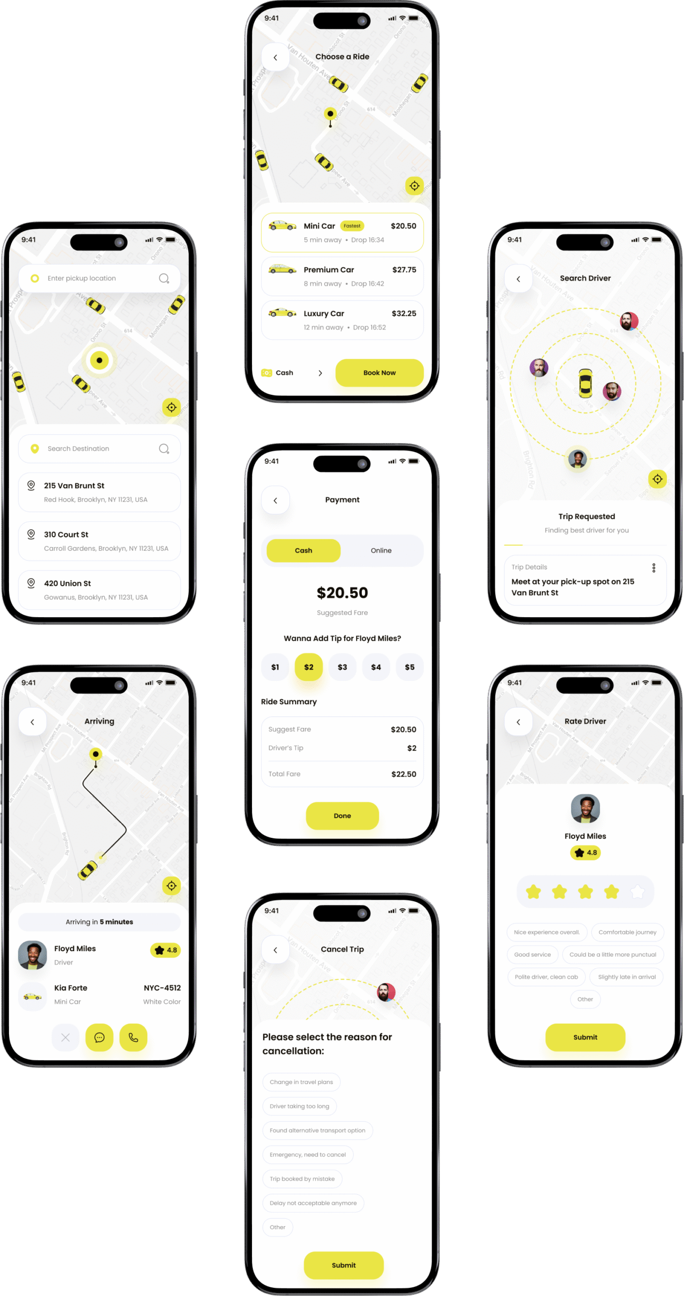
The booking flow is designed to be straightforward and stress-free. Enter pickup and drop location, View nearby available taxis, Confirm your booking, Track your driver in real-time, Enjoy your ride and pay seamlessly, Rate your driver to complete the trip.
we’d love to hear about your unique requirements! How about we hop on a quick call?
